
A Fieldtrip to the Ecole Des Beaux-Arts in Paris!


French Academic Drawings from the Archives
I recently went to Paris and had a chance to see some amazing academic drawings in the collection of the École des Beaux-Arts- so I wanted to share the drawings I was most drawn to (haha) and talk about some of the things I noticed in them! All of these are prize-winning drawings done in 12 hours in the Ecole’s evening class- if you’d like to learn more about that, check out previous post about drawing education in 19th c France!
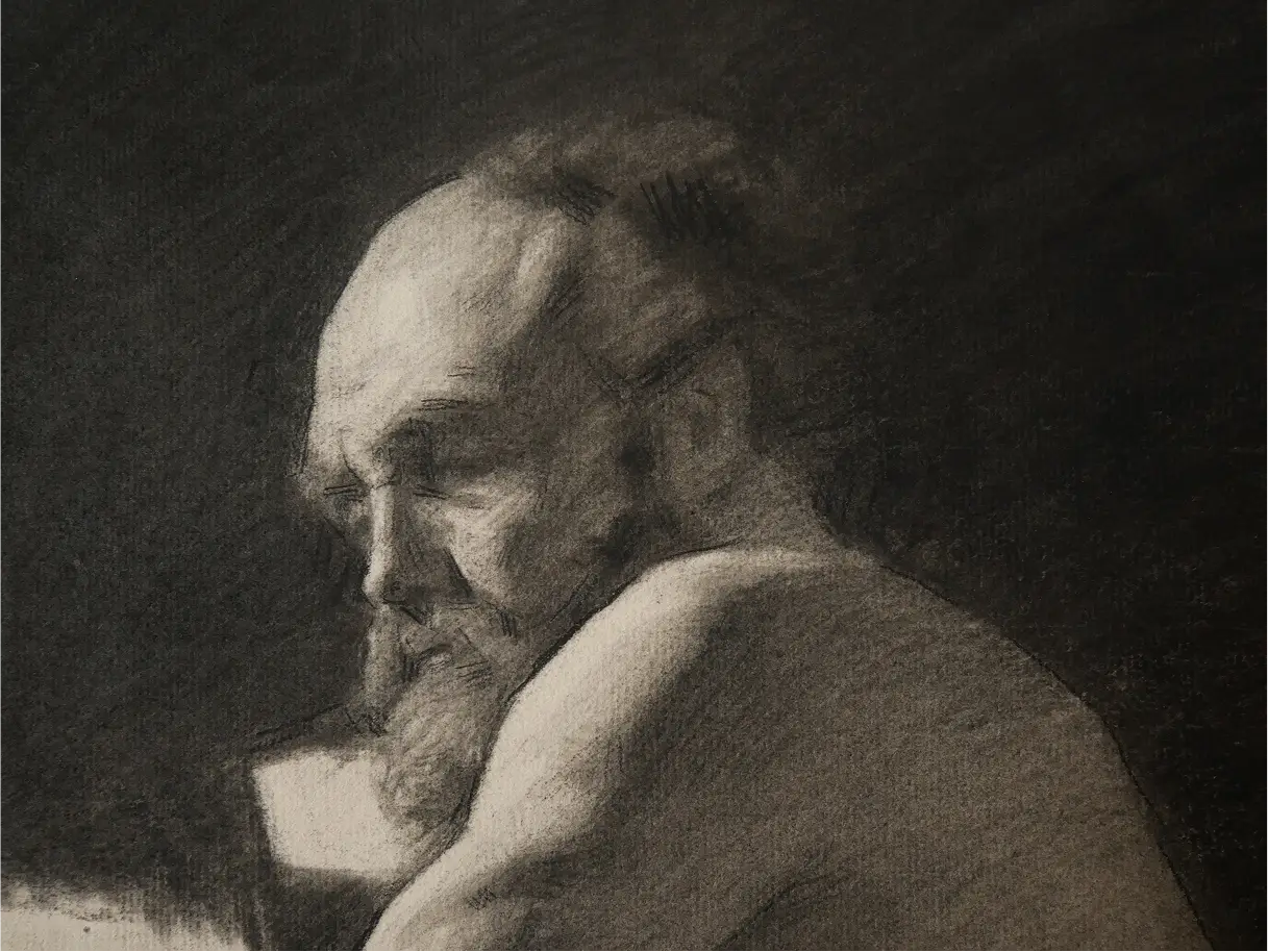
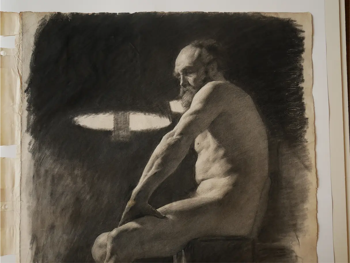
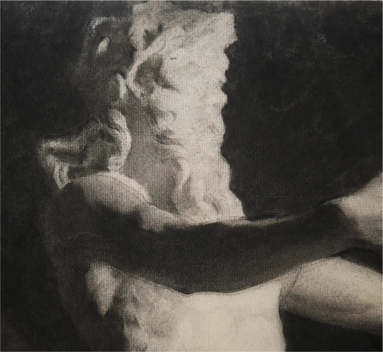
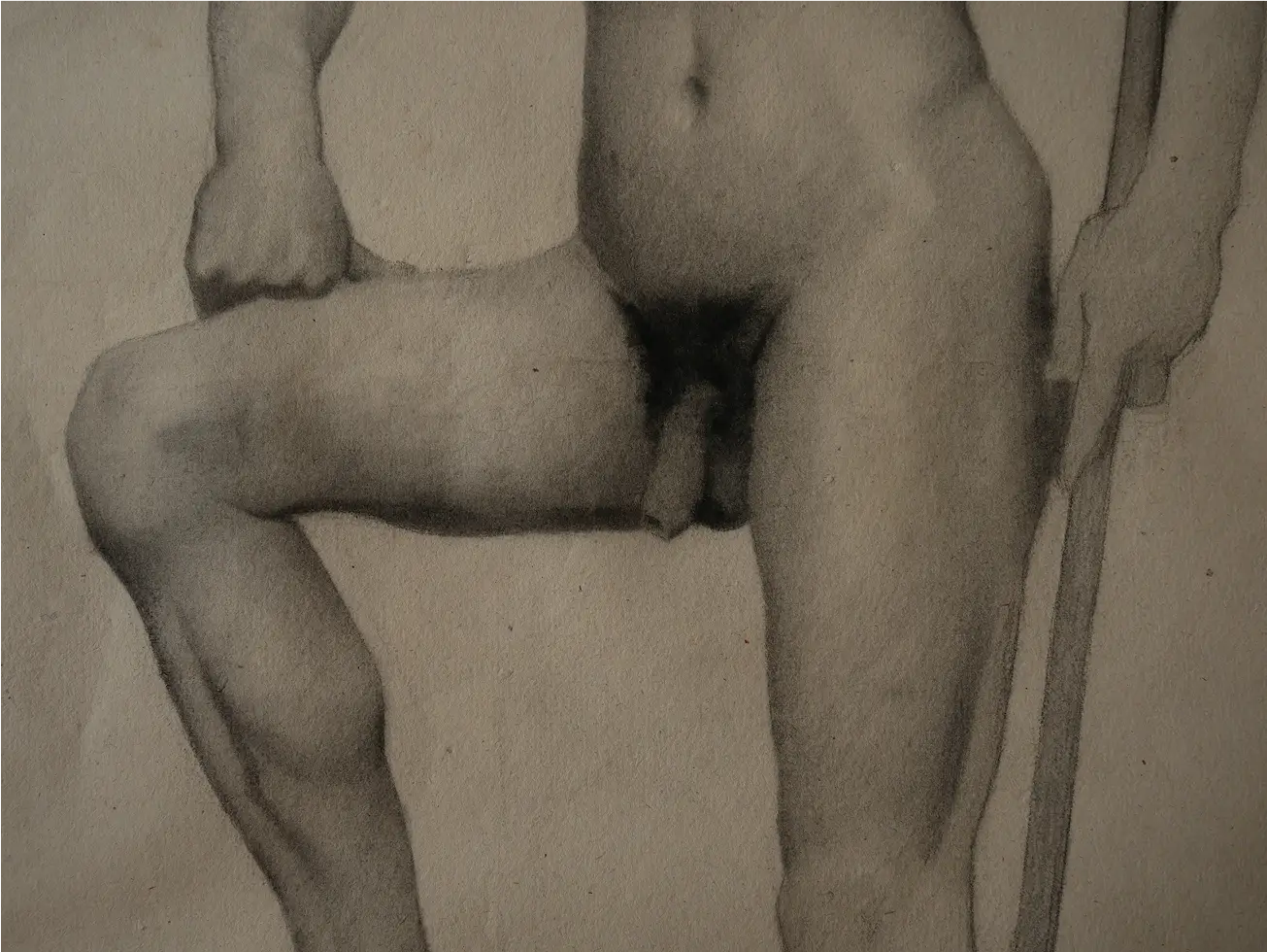
First up is this drawing by François Henri Morisset—one of my absolute favorites and exactly the kind of drawing I aspire to make—full of life and complexity, but not laborious.
One of the things I find fascinating is how little information there is on the head. If you look closely, the model doesn’t really have an eye, he barely has nostrils, and there isn’t much of an ear. Seeing the features handled so minimally is inspiring—everything makes perfect sense in the context of the entire drawing, but it also helps reduce the pressure to overwork every feature when drawing the model. It’s a good reminder to keep things specific, but to step back and draw the head as part of the whole body, not as something in isolation.
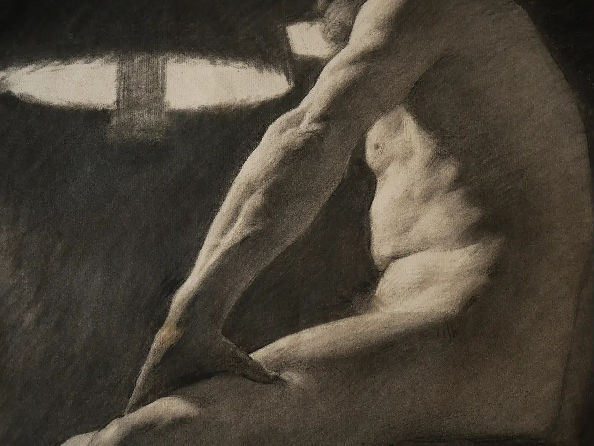
The same holds true for the lamp next to the figure. Seeing the jagged edges of what’s supposed to be an ellipse, seeing that it’s not mathematically perfect, is incredibly useful. From a distance it feels accurate, but up close you realize you just need the kind of accuracy that captures the spirit or the largest facts of your subject—you don’t have to micromanage the tiniest bits. This is a drawing that prioritizes seeing the forest instead of the trees.
One other thing I wanted to mention is how beautifully the rhythm holds together through the entire arm and the torso. You see it most clearly at the terminator—the place where the light meets the shadow. Even though there is a lot of detail, the long curve of each shadow is mapped out first. Then the smaller details of the deltoids, triceps, and other arm muscles—or, in the case of the torso, the small zig-zagging movements of the ribs, abdominal muscles, and serratus anterior—are all growing out of that long movement, like branches coming off a tree trunk. Again, it’s a kind of beautiful, intelligent drawing that rewards lucid thinking instead of blind labor.
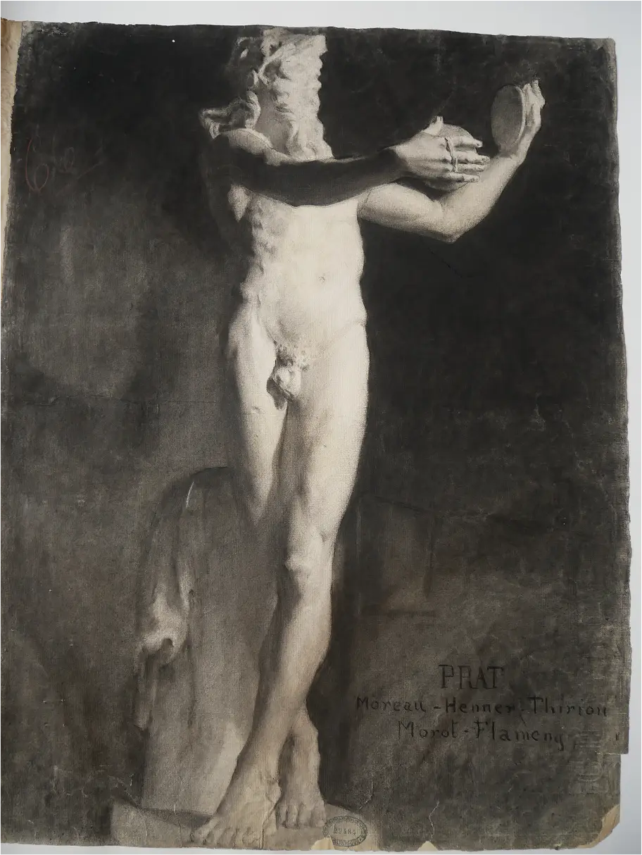
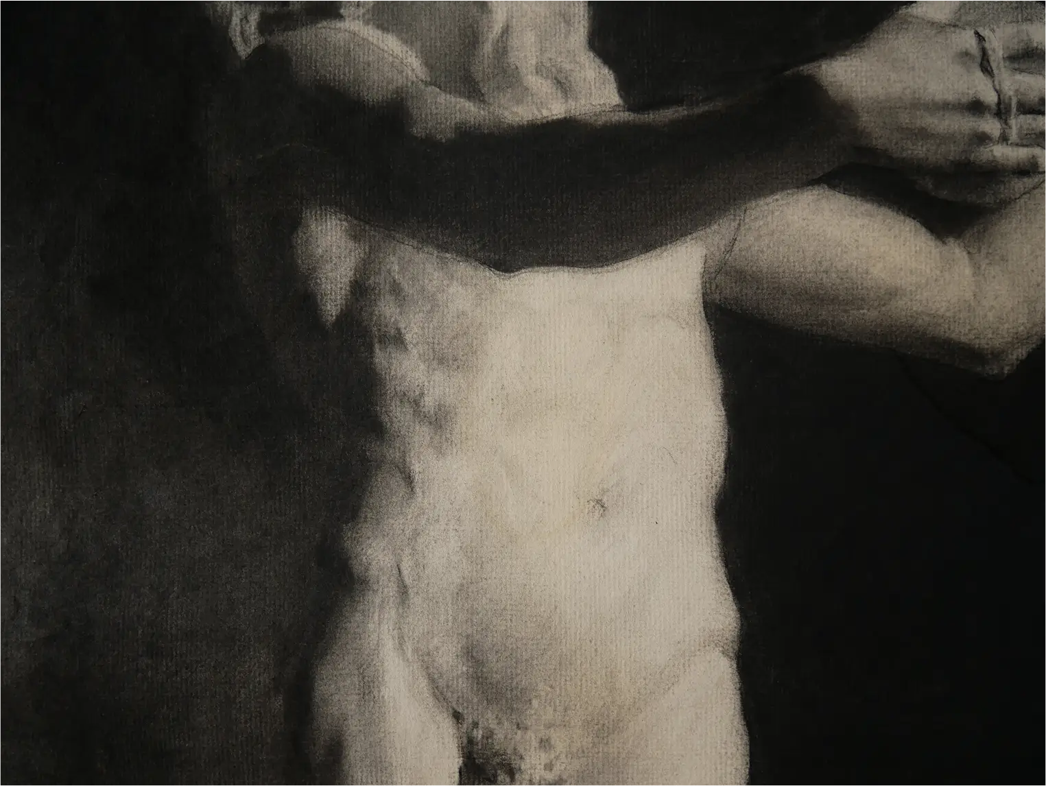
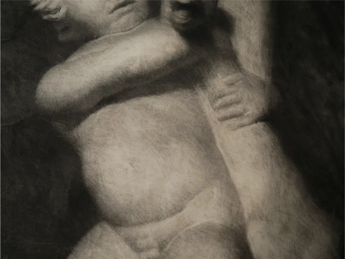
This cast drawing by Louis Marie Henri Raoul Prat is another one I’ve been daydreaming about for years- it’s one of the most luminous, beautiful examples of academic drawing I’ve ever seen, and it’s easy to see why it won a prize. A drawing like this represents a pinnacle—not necessarily in technique or in the use of materials—but in a kind of transcendent, extremely sophisticated intelligence in drawing. The impressive part isn’t the technical application, but how well-managed everything is—how all the bits of information that go into the drawing, are integrated to tell the story of the whole without distractions.
That integration happens in smaller segments, too. In the torso and the face, there’s extra information in the lights, but you never forget that these are the lights. Nothing ever gets so dark that it starts to feel like a hole or a shadow, the small changes just feel like small modulations of a bigger idea.
The face is probably the most shocking part because it literally looks like there’s nothing there. Intellectually, it’s easy enough to understand that through squinting, comparison, and value grouping, you can arrive at something like this and have that kind of control. But actually seeing how little there is in the face—and how well it still reads in the context of the whole figure—is still shocking. I think for me, it always will be.
This creates a fascinating alchemy where you can see the drawing is just charcoal and Conte stains on paper, but at the same time, it also becomes the real thing. Up close, it shifts back and forth between being both.
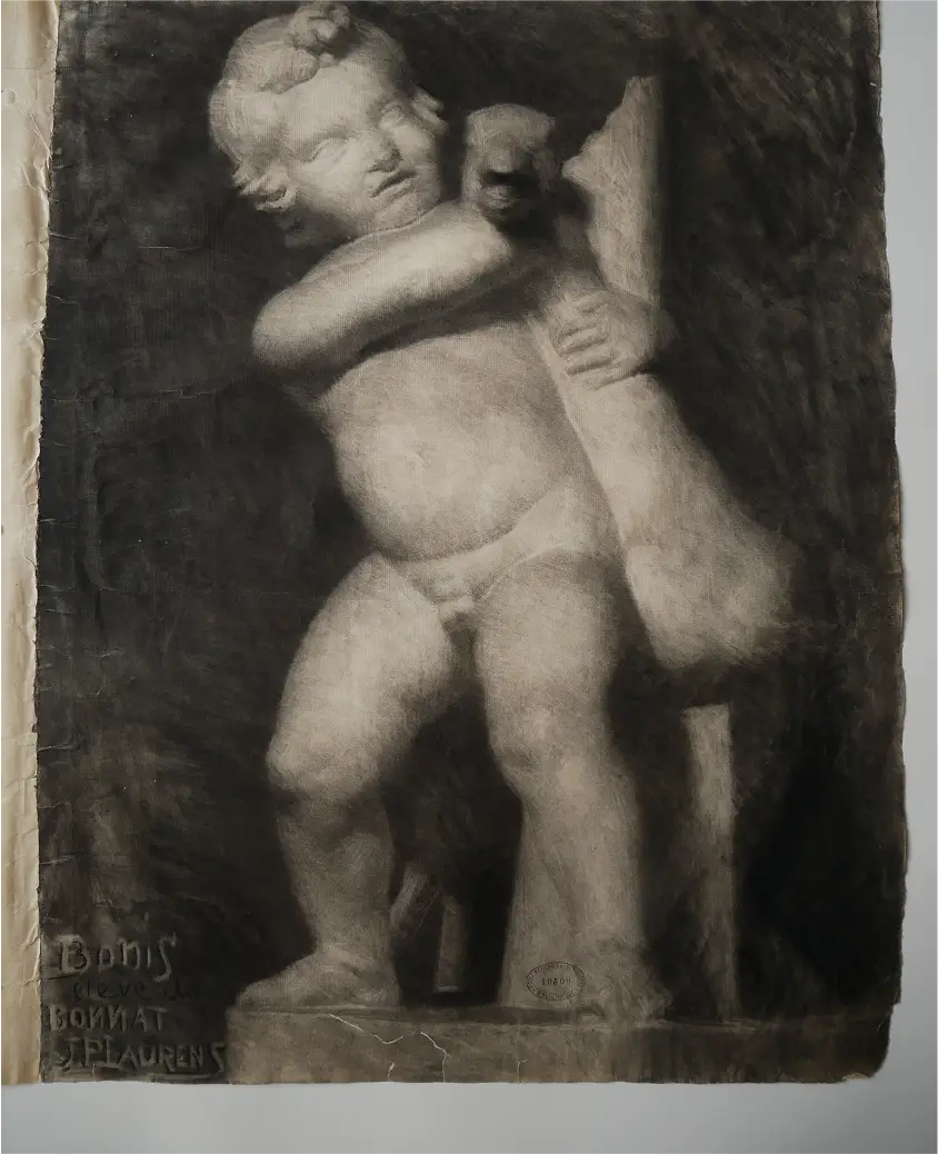
Then there’s the drawing by Henri Bonis, which was the real kicker for me. I did not expect it to look anything like this up close. I’ve seen plenty of other academic drawings of this boy attacking the goose—which I think is hilarious—but most of the ones I’ve seen are similar to the drawing by Julien-Jules-Alphonse Deturck, where the application of the material isn’t super tight, but it’s still slower and more deliberate.
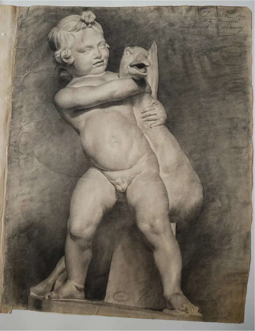
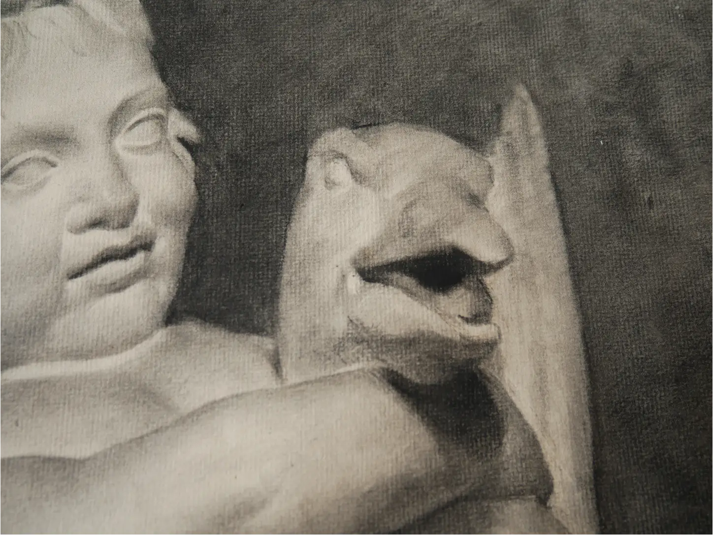
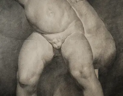
The Bonis drawing, on the other hand, feels chaotic up close. I’ve almost never seen an academic drawing with so much blurring or stitching of the form—the little tendrils form something like a basket weave—and that was very surprising! But it’s also a testament to the fact that, while these drawings were done with certain materials and under certain parameters, as long as you were thinking clearly and really trying to capture the character, movement, and structure of your subject, the way you went about it—your “handwriting,” so to speak—did not matter to the judges.
This is one of the things I love about looking at these drawings: the sheer variety in them. It’s interesting to see evidence against the idea that academic drawing has to be rigid. In a drawing like this, some half tones in the lights might go a little too dark, or some areas might feel slightly overstated—and yet it still works beautifully. There’s a margin where things don’t have to be 100% accurate or rigorously perfect, and you can still get a compelling result.
I find that tremendously liberating.
%202.webp)
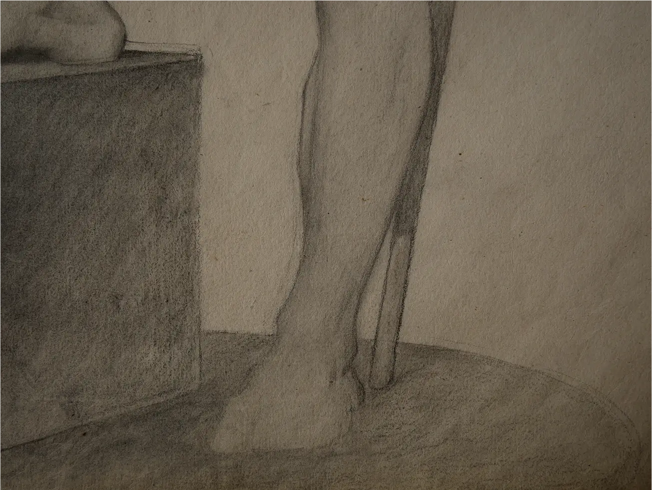
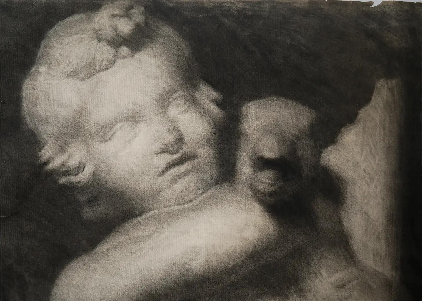
And finally, we come to this figure by Edmond-Georges Grandjean. This is one of my all-time favorite academic drawings—but not because it’s the most sophisticated or the most well-articulated. In fact, it’s actually a really goofy drawing in a lot of ways, and I have no idea why it won a prize. What’s special about it is that it literally shows you the process through which people achieved the unity we see in the previous drawings.
In the lower legs, you can really see the scaffolding—a structural sketch that articulates only the largest forms and how they fit into each other. Then the entire area is filled in with a base average tone, ignoring any small changes that deviate from the overall value.
As you go up the leg toward the thigh, he starts to modulate that average—erasing lighter parts and adding more material, whether Conte or charcoal, to add darker halftones. At this stage, there are still no small details; those will come later. In the face, for example, you see not only the broad modeling but also some small accents—lines made with the Conte crayon—that reinforce or darken certain areas as a finishing touch. This is very similar to how makeup is applied: you start with a foundation over the whole face, and then add lighter and darker tones as needed to create form and emphasis.
Once you see this process, it’s almost impossible to unsee. You’ll start noticing it in other academic drawings, and you’ll be able to reverse-engineer them more effectively. Remember: if an area looks fairly uniform when you squint,, you can make it the same—going for the similarities first—and then slowly introduce changes only as needed. It's sort of like baking a cupcake and making sure that the foundation is good and delicious before you add the frosting and the sprinkles, which are fun and exciting, but still a very small part of the actual overall experience.
Now it’s your turn! I hope these reflections help you enjoy and understand these drawings even more—and that you can take lessons from them and use them to make the art you care about!
We’ll be posting the high-res images soon, so if you want to see more of these academic drawings, check them out in our gallery. And if you want to learn how to do this yourself, download our FREE drawing guide (pinned to the top of the references page)!
-Ramon
Related articles
%201%20copy.webp)


