What a Limited Palette Can and Cannot Mix
A lot of painters get caught up in the idea of only using a “limited palette.” The most popular one is the Zorn palette, which consists of only four pigments: white, black, red, and yellow. Notably, this palette lacks one of the primary colors in oil painting: blue. Instead, it cleverly uses black as a way to desaturate colors, making them look cool, or bluish, by comparison when placed next to the other warm colors. This palette is named after the Swedish painter Anders Zorn, who frequently painted with it. However, it must be noted that many of his paintings include colors that are impossible to mix using only these basic pigments
And that is exactly the point. If you only have red and yellow, you’re going to have a very hard time mixing a vibrant purple. Painting with a limited palette is a great way to start oil painting. Buying only four tubes of paint is much cheaper and far more approachable than starting with a full palette of 10 or more pigments. You can also produce some incredible work with limited palettes. The range of flesh tones that comes from the Zorn palette alone is astonishing.
Students often get so comfortable with their limited palettes that they don’t realize how much color they are missing. I remember that, a few years ago, I was struggling to mix the color of a vibrant purple piece of cloth. I kept convincing myself that I was just muddying my mixtures and that I could get the color perfect as long as I was disciplined. But no matter how much I tried, the color was never quite right. The next day, I went out and bought dioxazine purple for the first time and easily mixed the right color on my first try. The problem wasn’t my lack of patience while mixing. I was using a palette that wasn’t capable of reaching the proper purple.
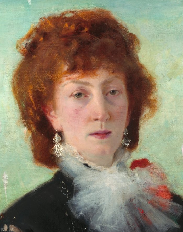
What Ramon and I love about 19th-century painting, and what makes it so unique, is its truly incredible sense of color. Staring at a 19th-century painting doesn’t just feel like admiring a nice portrait. It feels like looking at a living, breathing record of something real, a portal into another world. Much of that feeling is owed to the incredible color, which, in most cases, you won’t achieve using only a limited palette.
Hue, Saturation, and Value
Whenever I am mixing a color, I am thinking about its three components: hue, saturation, and value, or HSV. Hue is what we typically think of when we hear the word “color.” It is the appearance of something. Grass is green, so it has a green hue. The sky has a blue hue. Hue is the rotation around the color wheel. Saturation is how gray a color is, or how far it is from the center of the color wheel. Value is how light or dark something is. A color can be dark, or low-value; grayish, or desaturated; and red in hue.
Your Palette's Gamut on the Color Wheel
We all learned about the color wheel as children, so it’s a very intuitive starting point for us. The color wheel demonstrates every possible color we can mix on our palette. Each pigment we choose plots a point on the wheel. The perimeter of those points forms an enclosed shape. That shape is our gamut, the total range of colors that we have the ability to mix.
You can see that, with the Zorn palette, we don’t have the ability to mix most colors. However, the range we do have encapsulates a huge variety of skin tones, making it a very good limited palette for painting portraits. I’ve had students ask whether the Zorn palette is okay to use for landscape painting. The answer to that is a resounding no. Maybe if you live in the desert, you can paint some rocks and sand well, but you’ll miss out on the brilliant blue sky, the green cacti, and the wealth of color lying latent in any landscape until you look closely. If your landscape isn’t made of flesh, then the Zorn palette won’t work too well for it. And you might be taking the “Mother Earth” thing a bit too seriously.
Which Colors Are Worth Buying
The natural way to combat this is through exactly the same process I described earlier. If you’re having trouble mixing a color correctly, it might not just be a skill issue. You might be lacking a wide enough gamut from the paints on your palette. You can paint anything inside your gamut.
Low-saturation colors tend to be very easy to mix. That’s why, if you buy a tube of “pastel” pink and look at the pigment information on the back, it’ll just be pink and white mixed together. You can skip buying that and make it on your palette instead.
High-saturation colors on the edges of the color wheel are the ones you’ll find yourself needing to buy. Technically, you can mix everything inside a massive gamut yourself, but highly saturated colors like quinacridone magenta tend to be more expensive. It’s also a bit of a waste of time to mix your own yellow ochre or other earth colors. It doesn’t make much sense to buy a bunch of beautiful, jewel-like colors and then mix them into piles of mud. Colors that can be mixed from others but are used often enough to justify being purchased on their own are called convenience colors.
Why the Color Wheel Is a Lie
You may be thinking to yourself that this is all too easy and that you could really use the feeling of your brain being wrung out like a wet sponge. If that’s the case, then let me finally tell you that these simple color-gamut diagrams are mostly a lie. Really, they’re an oversimplification. That becomes rather obvious when we look at our sample Zorn palette. I told you that this was a very “wide” range of skin tones. But it’s obviously not. I can think of a whole lot of people who don’t fit into this very narrow range. That’s because this isn’t the full range of the Zorn palette. It is a tiny cross-sectional slice.
A color wheel is two-dimensional. It only maps hue and saturation. It’s completely missing the third variable I mentioned earlier: value. So this presents the question: Why do we use 2D charts to describe something that has three dimensions? And what does 3D color look like?
Plotting Color as a Cube
I first had this question while describing this same concept of gamut to a student. I was lucky enough to have just finished a long stint learning Blender’s Geometry Nodes, which are basically a visual form of programming. So I decided I’d try to crack the code myself. I had no idea that someone had already asked this same question more than 100 years ago. Funny enough, that person studied at the École des Beaux-Arts, so this really does come full circle. No color-wheel pun intended.
I first decided to do the most obvious thing: plot out a 10 × 10 × 10 cube, with one axis each for hue, saturation, and value. I was naive enough to think that this would be most of the battle. But I quickly noticed that something wasn’t right about this cube. If the entire top row is 10/10 value, it should all be pure white because the brightest possible value is pure white. Mixing any color into white, by definition, dilutes it and reduces the value. But this top row had a massive range of colors on it, and turning it to grayscale showed that there was quite a large range of different values within the group. Some colors, like yellow, were very close to white, but others, like blue, were significantly darker
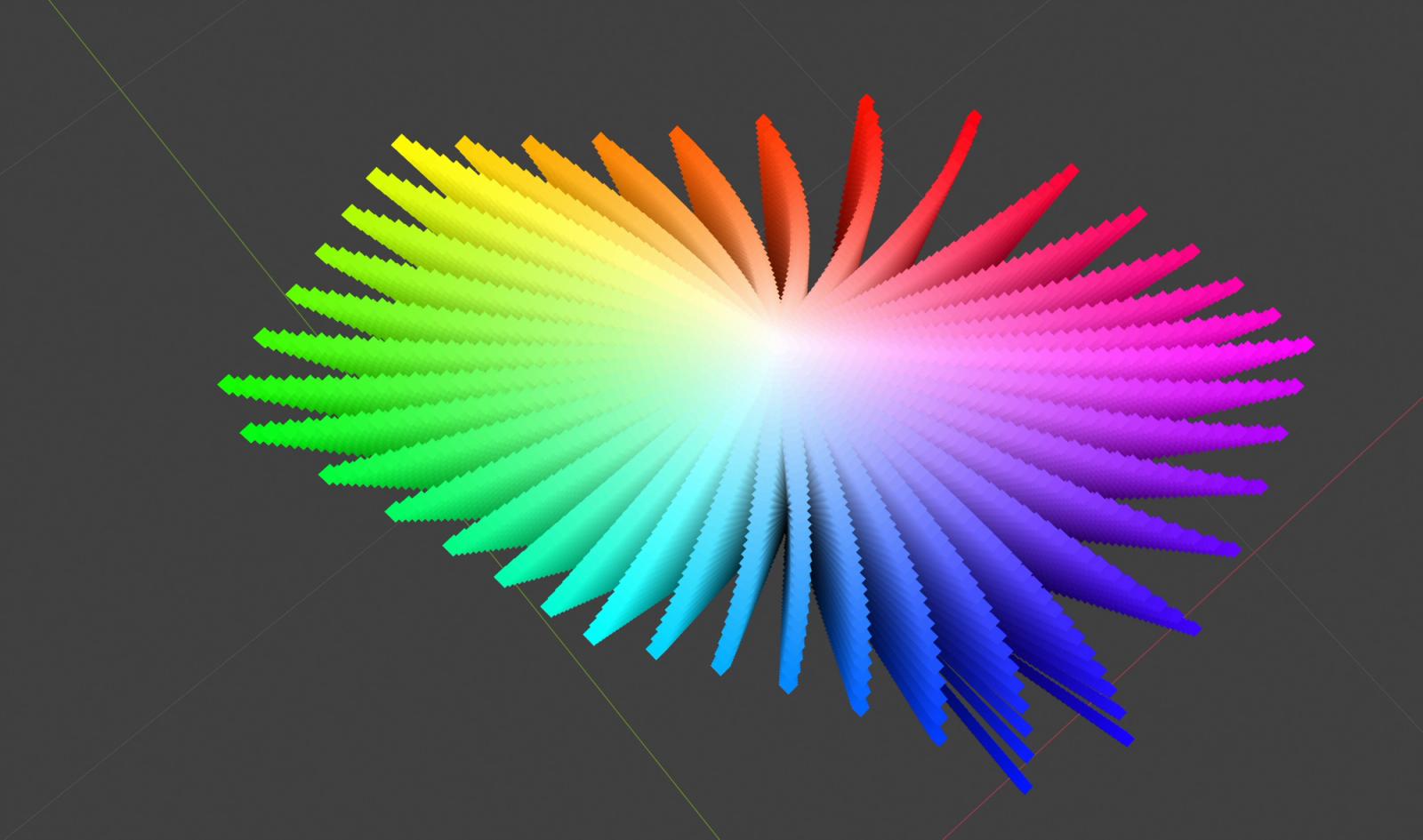
I thought that somehow the geometry must be messing with this. So I decided to lay out strings of points, with each string having its own color and value representing its height. I then wrapped those strings around a circle, letting the hue represent the angle from the center. Basically, I made a 3D color wheel: a color cylinder. But this was just the same information shuffled around. Nothing had happened to the value axis, so it suffered from all the same problems as the cube.
Why Your Eyes See Blue as Darker
The problem is that our eyes only see certain colors within certain ranges, and those ranges are different for every color. Our eyes see colors roughly as red, green, and blue, but it’s not an even split. We are incredibly good at seeing greens, probably because most of nature is green, and being able to detect incredibly subtle differences in patterns of foliage might mean the difference between life and death. We’re okay at seeing red, but nowhere near as good as we are at seeing green. And we’re uniquely bad at seeing blues.
Our eye sensitivity works out to about 72% green, 21% red, and 7% blue. This means that if we shine a pure green light with an HSV of 100% saturation and 100% value, we will see it as a green that is about 72/100 on a value scale. It will be a moderately bright light, but not a 100% pure white light. If we shine a pure blue light with an HSV of 100% saturation and 100% value, we will see it as a blue that is 7/100 on a value scale. Extremely dark. Our eyes just aren’t very attuned to seeing blue light, so highly saturated blues look much darker to us.
Frequently, while painting landscapes en plein air, I think about how dark and saturated a blue sky can be. It’s often much darker than I expect it to be, despite it being a bright, sunny day. It only gets lighter toward the horizon, where the atmosphere makes it appear whiter. That’s the reason. Our eyes just aren’t that great at seeing super-saturated blues, so they look much darker to us. HSV is an incredibly intuitive way to think about painting. But it is flawed for this reason. It doesn’t take into account that humans see different colors at different ratios. If we want to have a 3D representation of color that is sorted by how we perceive colors, then we’ll need another approach.
Perceptually Balanced Color Spaces
Thankfully, someone already solved this more than 100 years ago, and it has been refined repeatedly since then. A 3D shape that sorts colors by the value at which we see them is called a perceptually balanced color space. Traditional oil painters don’t really have to deal with these problems all that much. We are accustomed to constantly adjusting and mixing on the fly. It’s easy to develop an intuition that yellow colors are lighter than blue colors at high saturations, and the thought doesn’t need to go much further than that. You’ll notice this the first time you put these colors next to each other on the palette.
From HSV to Oklab: The Color Space Transformation
This space has been pushed forward by media and industry, particularly through the need to check dyes and pigments exceptionally precisely. In more modern uses, it has been advanced by computer scientists and designers who constantly make gradients and color ramps throughout their work. Making a gradient from yellow to blue while maintaining the same value isn’t possible using only HSV. What you need to do is take HSV, which weights each color equally, and make it weight colors the way our eyes do.
This is where we have to do a bit of complicated math, and I don’t want to pretend that I’m a scientist here. I’m just a painter with a bit too much persistence for my own good. Going from HSV to a perceptually balanced color space, in this case a very modern one called Oklab, is called a color-space transformation. All color exists in three variables, however you want to define them. If something has three axes, then it’s 3D. So color isn’t a flat plane. It’s a color space.
The transformation itself converts HSV to RGB, but there’s a catch. The way computers display RGB is technically something called sRGB, which is RGB weighted so that we have more room to perceive details in dark areas. sRGB has to be converted to linear RGB. Then, through a series of matrix multiplications, we convert it into something called LMS cone space. This step applies the uneven 72%/21%/7% weighting mentioned earlier to RGB. The numbers then need to be reweighted relative to how we perceive value and sorted according to how we use that information. This is the final conversion into the Oklab color space.
This was supposed to be a simplified explanation, but it’s a bit difficult to make that happen with this topic. If you want to learn more about the exact math involved, you can get all the numbers from this blog post by the creator of Oklab: https://bottosson.github.io/posts/oklab/
The Oklab Crystal
What matters is that this is a beautiful transformation. The end result looks like a crystal of color. The peak is pure white, the brightest any color can be. The bottom is pure black. As you scale upward along the Z-axis, value changes smoothly. You can clearly see how colors like blue exist only in the lower ranges of the value scale, while colors like yellow and green can get very close to pure white. Does this mean that HSV is outdated and based on bad color science? Should we all switch to Oklab or another perceptually balanced space instead? A lot of people are quick to jump to that conclusion after learning about this concept. But it stems from a poor understanding of how this works.
Maps, Globes, and Choosing a Color Space
It’s much easier to see the scale of countries on a globe than on a flat map. When you use a flat map, there is always some level of distortion, often causing Greenland to look like it’s the size of Africa. That’s because you can’t take a 3D object and map it into a 2D space without sacrificing something. But that doesn’t mean maps aren’t useful. No one is going to carry around a globe, and Google Maps doesn’t guide your car ride along a 3D model of the Earth.
Different color spaces have different uses. No one can hold Oklab in their head and calculate each color instantaneously the way a computer can. But web designers and software can run those calculations to create gradients. Oklab was only introduced in 2020, and since then, it has already become the default way Photoshop draws gradients.
For traditional artists, HSV is still by far the easiest system to wrap your head around. Even though it has its flaws, they’re not very important for traditional painters. If you’re trying to mix a 90% saturation, 100% value blue, you’re going to take your blue and keep adding more and more white. Pretty soon, you’re going to realize intuitively that blue has to desaturate to get brighter past a certain point.
The Zorn Palette in Three Dimensions
However, this process helped solidify a more important lesson in my mind. Color isn’t a flat 2D wheel. It’s a 3D space. And we can navigate however we want around that 3D space, like sailors charting the seas of color.
Remember earlier when I pointed out that our Zorn palette diagram was mostly a lie? That’s because it didn’t have a third axis. So why don’t we plot the approximate Zorn palette inside our Oklab space? This is the true range of colors that this limited palette can mix. Now we can see that it is capable of mixing a much broader range of light and dark skin tones than what we saw before, which was only a single arbitrary cross section.
The pigments you put on your palette aren’t just points around a circle, although most of the time, that level of simplification is all you need. They define the perimeter of a 3D space. A better understanding of that space allows you to navigate like a hardened sailor, effortlessly crossing the oceans of color. The more you know, the more possibilities there are for creativity. That’s the whole point of art: creativity and learning.